 A while ago I wrote about Radium, a great app for listening to internet radio on your Mac and iOS devices, but which was rather blighted with one of the stupidest, most incongruent and confusing icons I could possibly think of for such an app: a heart-shaped chocolate.
Yes, a heart-shaped chocolate. For a radio app. I know.
This extended to the menu-bar icon, which was particularly galling to me so I wrote another post explaining how to edit the Radium app package to insert the original radio icons.
I’d always liked Radium, but I absolutely loathed the new icon and as I care about this sort of thing I wrote to Catpig to ask why they’d changed it. At first they brushed off my suggestions that it wasn’t the most obvious choice saying it was in keeping with their new tag line ‘chocolate for your ears’ (yep, also weird) but ultimately they weren’t that interested in taking any feedback and just got rude, suggesting that I was an idiot for not understanding design. I suggested they were the ones that put highfalutin but incongruent ideas ahead of user recognizability, but they made it explicitly clear that they couldn’t care less what I thought.
Well, I wasn’t the only one utterly bemused by the ridiculous new icon: a few users who saw my post mentioned in the comments some of the rude replies they’d received from CatPig when they too got in touch to ask about the icon. It seems that even though CatPig ask for user feedback on their site, they’re really not that interested in actually receiving it.
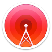
Or, are they? I’m afraid after the very rude replies they sent me I deleted Radium and subscribed to Rdio, so I never noticed a Radium update that completely changed the icon again until someone mentioned it in the comments recently. It seems CatPig finally got the message and switched from the ridiculous chocolate to an altogether more sensible radio tower. And it’s rather lovely!
Well done, CatPig! You’ve now got the best internet radio app and one of the best icons. Hopefully a customer interaction attitude adjustment is up next…?