Categories
iOS & Mac reviews Reviews

my mostly positive review of Hipstamatic Disposable

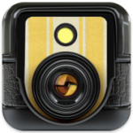
The creators of Hipstamatic have a new app in the Store. It’s called Hipstamatic Disposable (App Store link), it’s free, and if nothing else you should download it just to experience the user interface because it’s gorgeous.

As iOS photo apps go it’s as accomplished as you’d expect from Synthetic. However, despite how much fun it is to use, it’s quirks may put you off in the long term. I also have a bit of a problem with the in-app purchase model, and there seems to be a bug that causes unpredictable crashes. There’s lots I want to talk about because the app deserves it, but this is a fairly long post so you might want to get comfy, send it to Instapaper, or skip to the end

First, some context

You may already know that I love toy camera photo apps. I know there are those who balk at the irony of emulating retro photography on a digital camera (and that’s fine, although if you’d like to share such opinions in the comments below, please don’t) but I really enjoy using them when they are done well, an achievement which is as much about the user interface and experience as it is about the final output. I loved the simplicity of Instagram until their 2.0 update left their filters feeling kinda neutered so I went back to Hipstamatic to sate my fetish for digital toy camera emulation.

The original Hipstamatic (App Store link) is the archetypal toy camera app: a detailed skeuomorphic UI that replicates the front and back of a plastic camera; interchangeable lenses and films; and a realistically vague viewfinder. Where it suffers is the abundance of choice – over 260 different lens and film combos alone. Thankfully, there are now settings to disable films, lenses or flashes you don’t like, plus a ‘shake to randomise’ feature that only uses filters you’ve approved for inclusion. This is how I use Hipstamatic now – launch, shake and snap – it’s quicker than hand-picking a combination and introduces an element of surprise when the resulting photo pops up.

Enter the D-Series with it’s crazy new ideas

The new app, Hipstamatic Disposable, keeps up the tradition of wonderfully detailed UI design but deviates from the template in a couple of significant ways.

First, instead of one camera into which you load different lenses and films, Disposable introduces you to a fictional range of disposable plastic cameras called the D-Series, each with their own effect and a slider to alter the intensity of each shot.

You get three cameras for free
Choose from a range of extra cameras
Each camera has it's own realistic packaging

The app comes with two camera types pre-installed with a third free if you connect to Facebook (this is just to provide a network of friends to share cameras with, and no other purpose; more later). As in Hipstamatic, further cameras, or rather effects, are sold in-app via their HipstaMart where each camera hangs on a rack in its own cute cardboard-and-plastic retail packaging, just like Star Wars figures; like I say, they’ve put a lot of care into the details.

Currently four of the purchasable cameras are priced at 69p (99¢) for unlimited uses – that means that when the camera is ‘used up’ the camera itself respawns and you can start another (the included cameras are also unlimited); three further cameras/effects are priced in bundles with limited uses; nine uses costs 69p; 36 uses is £1.49 and 99 uses is £2.49. When those cameras are used up, that’s it. More on this feature later.

Swipe through active cameras or navigate to other screens
Print sets from completed cameras are collected here
Select a print to see metadata and sharing options

The second big deviation from photo app tradition is that each of these cameras has 24 frames available to shoot and you don’t get to see any of the photos you’ve taken until you’ve shot all 24 frames, at which point the shots are processed and presented to you – just like the old days! From here you can save either the entire set or just individual images to your iPhone’s Photos app; by default the app automatically saves the entire set to Photos upon completion but I’ve turned that off while I test the app for this review.

Highlighting individual images shows you metadata including who shot the image, which camera was used, the intensity slider setting, location and date. One for the real camera users out there: the intensity slider appropriates f-stop numbers for the scale, from 2.8 up to 22. Nice touch.

The 24-shot nature means that, yes, I’m likely to often end up processing cameras that contain images from weeks ago as I drift between cameras taking ages to finish one; that could be frustrating if you value chronological order in your Photos app, but it’s not the end of the world.

Much more importantly, it brings a new sense of fun and discovery to getting ‘films’ back weeks after shooting them (just like the old days!). The sense of glee at re-discovering shots you’d forgotten ever taking has almost completely died out with the slow extinction of film cameras and the rise of digital, so kudos to Synthetic for bringing it back.

Also, such a limitation makes for a superb motivation to find projects that I can shoot in 24 frames – and then make them count; necessity is the mother of invention and all that.

Personalise each camera with a name and sticker
Sticker designs are bold and fun; names default to the date
I like the vertical design but it can be awkward to use

One of the most enjoyable aspects of using this app is the real attention that’s been lavished on every stage of the process. Every camera is so lovingly rendered they beg to be used. When you first pick a camera you get to name it, perhaps for the event you’re attending, but hey, why not call it Lord Percy? This is incorporated into the retro-inspired label you pick for the camera shell, each with three choices of colour scheme. The camera layout itself is nice and obvious, using a vertical orientation with the viewfinder at the top, the effect slider, flash, and a large friendly shutter release button below.

So, what if you don’t want to use the same camera for 24 shots before trying a different one? No problem – you can have more than one camera on the go at any one time (another reason you may want to name the cameras), switching to a different camera whenever you fancy.

The effects generally mark a welcome move away from the grungy extremes of Hipstamatic. Some will be familiar to Hipsta veterans such as the BlacKeys 44 and Foxy X69 (both premium purchases). An effect slider adds some variety; for example, on the Rodney ZX9 it adjusts the amount of zoom applied to a ghosted double-exposure that overlays your shot; on the Unicorn MG it controls the opacity of the rainbow-coloured light leaks.

The majority of effects are pleasing to my eye in some way although of the purchasable cameras I’d say they’ve definitely picked the right ones to charge more for; at least if you only go for the 69p options you’ve not lost much if you don’t use them often. But remember, once you’ve picked a look you’re stuck with it for 24 shots so pick well!

At the bottom of this review I’ve posted some of my favourite shots from the test reels I made while writing it. They aren’t going to win any awards but they might give you some idea.

The Invitations screen if you're Billy No-Mates. Like me, usually.
When starting a camera you can invite friends
Joining a camera invitiation from my brother

Disposable also has a social feature in which you invite friends via Facebook to start a shared camera (I know, I know; I hate Facebook too). Each invited participant starts a new camera and shoots images on their own phones. When all the cameras are finished everyone’s images are pooled, resulting in an album that gives a much wider range of moments than any one photographer would have captured. It’s Synthetic’s in-app version of having everyone dump their digital pics in a Flickr or Facebook event pool, basically.

(At least, I think this is how it works – I encountered some serious problems while exploring the social feature which I’ll explain shortly)

I love the idea in theory but it feels best suited to social events and I’m an antisocial bugger so there will be few such opportunities for me to make the most of it. However, I can see this being a big hit at a wedding or a party so long as there’s at least a few attendees that are Facebook friends and have the app (which is free of course, so no excuse there). In fact the more I think about how well this would work at events the more I think that social animals are the real target market.

For this review I asked my brother, all the way back home in Glasgow, to download the app and we shared some shots using the MegaZuck 84 camera. Or at least we tried to when we weren’t experiencing an appalling, almost non-stop…

… CRASH!

This is a real stinker; this version of the app (12, according to iTunes) has some unidentified issues which can cause a regular crash – as often as 10-20 seconds into launching the app. Although the app had been completely stable for several hours while I tinkered with it on my own, shortly after I connected with my brother via Facebook and started a camera with him I experienced my first crash and they kept coming. While we were shooting our cameras we had the same experience, no matter what we tried.

Once we’d both managed to complete our reels and our images were downloading to the other’s phone we continued to experienced crashes, but later on once my app stopped receiving new images from him it became almost completely stable again with very rare crashes.

Incidentally, the one camera we both managed to finish together despite the crashes isn’t displaying 48 images as I’d expected it to. There are 19 of my images, 8 of his. That doesn’t even add up to 24 so I’m not sure what’s going on there.

Later on I accepted two invites from him to start new cameras; I think he sent these earlier and I just didn’t get them amidst my crashiness. I was able to finish both cameras with just one crash towards the start both times. At this time he wasn’t using the app so perhaps it’s an active connection to another user that causes it.

(UPDATE, 24th Dec 2011: this morning my bro sent me a camera invite and started shooting on it himself and didn’t get a single crash. Later, when I accepted the invite and started shooting I didn’t get any crashes either. However, in both cases the other user wasn’t using the app at the same time. I still think it’s related to an active connection – or maybe the bug is related to server-side software as opposed to bugs in the app code, and has been fixed already?)

Either way, there’s lots of complaints on Twitter and the App Store review page so it’s the sort of thing that will probably be fixed very soon and then perhaps I’ll be able to work out how it’s actually supposed to work. Worth bearing in mind for now.

My niggles

… are a bunch of things that niggled at me but wouldn’t put me off completely. I just think that if they did it my way it would be that little bit better, obviously.

First, you have to shoot with the phone in the vertical position; if you go landscape the camera doesn’t auto-rotate. This fits with the ‘phone-as-toy-camera’ metaphor (real film doesn’t detect orientation) but limits how you can use the app; getting the lens very close to a horizontal surface (e.g., for a shallow depth of field effect) is harder and I found that surprisingly often it’s more comfortable getting the shot you want by turning the phone sideways. I know I could rotate specific prints once saved into the iPhone’s Photos app, but that’s just hassle, man.

Between Hipstamatic and Disposable I prefer the vertical alignment of the D-Series controls and also the fact that the viewfinder is close to the iPhone lens. However, I’d prefer it more if unlocking the auto-rotate ability was an option for those of us willing to break the illusion of a real toy camera.

I’ll briefly list my other niggles, in no particular order:

  • prints are square but the viewfinder is ever so slightly rectangular – wider on the horizontal. I was disappointed when I first realised my prints weren’t the same; there’s so many square camera apps on my phone that the variety would be nice.
  • on some cameras, particularly the Dreamy, moving the effect slider around didn’t appear to change anything noticeably
  • the only option to connect with friends is via Facebook. I would dearly like to delete my Facebook account forever but apps like this (and websites that choose to use the Facebook login APIs exclusively) force me to keep it hanging around. I asked @Hipstamatic if there was any chance of adding Twitter for friend connection and they replied that there was a chance, but not quite yet. They’d be mad to leave that on the back-burner.
  • in-app, you can view individual images with their notes but you can’t tap again to make the image full-screen on black and zoom in on details; you can in Hipstamatic and it would nice to have it here.
  • when shooting you can’t tap to set the focus or exposure point. You also can’t pinch to zoom but that really would break the metaphor so that’s fine. However, the camera’s getting to choose the focus and exposure so why can’t I? S’not fair.
  • once you’ve purchased cameras, you can’t change the order they are listed in your camera bag. I like to organise things in a way that makes sense to me; just needs an ‘Edit’ button.
  • if you start a camera and then don’t use it and want to remove it from your active cameras, you can’t; make sure you pick the right camera and the right name.
  • similarly, you can’t decide to have a film processed with blanks left; you could choose to do this in real life so technically it should be there, right? 😉

(okay, the last two are really picky. I realise the option to end an unfinished camera would rather kill the mood but what if there’s a handful of event snaps at the start of a camera and then you have to shoot 20 unrelated snaps just to get access to them? Nnnngg, dammit)

About those IAPs

As mentioned above, some of the purchasable cameras (effects) in the app are not unlimited. These limited-use cameras follow the real-world metaphor that when they’re done, they’re done, and you gotta buy new ones.

When I first heard about this idea of charging per shot in a digital camera app, I was pretty damn outraged. In the original version of this post at this point I went on for several paragraphs wrestling with outrage versus the fact that the prices really won’t break the bank and the app is free as it is and even a 36-pack will take so long to get through it may as well be ‘unlimited’, but then again it still doesn’t assuage my disapproval of charging per shot for digital, and so on…

(At current prices I calculated the use per 24-shot-camera at 7p each for the 9-pack, 4p for the 36-pack and 2p for the 99-pack)

As I considered and reconsidered, I slowly realised that… actually… I find it strangely appealing that in this fantasy world of the iPhone-as-disposable-camera I have to pay for opportunities to use a particular model of camera and then shoot all the shots before I get any back. It does actually lend a certain sense of importance to each frame you shoot, because you’re paying (hardly anything whatsoever) for it.

And I hate that I have to admit this because I do think it’s a dangerous precedent to set for IAPs in photo apps simply because unlike film, digital photos don’t incur a cost-per-shot in the same way; however, I’m forced to admit Hipstamatic Disposable actually gets away with it purely by virtue of the effort that’s gone into maintaining the illusion of reality throughout the experience.

So don’t anyone else get any funny ideas.

I should add that although I haven’t verified it, I think that when Synthetic first released the app their rates for the IAPs were not as good value as they are now and may have been pressured into bettering them by user complaints. So long as they spread the love with a mix of unlimited and limited IAPs in future I could live with grabbing a 36-pack of my favourite premium cameras. I doubt I’d run out any time soon.

In conclusion

Realistically this won’t completely take over from the other apps I use daily due to the convenience of their one-shot nature, but the enjoyment I get from using the D-Series cameras is such that I want to find ways to use them; I’ve got a couple of cameras on the go right now and I’m looking forward to the day I get them all back, whenever that may be.

And the IAPs? I still think it’s a bold step to charge users per shot to take digital pictures but look; the rates aren’t bad for the actual usage you’ll get; it makes some crazy sort of sense in terms of the whole package; and, perversely, it really does immerse you in the experience of using the D-Series cameras, which is what I’ve been raving about throughout this post.

Sadly, at this time it certainly seems to me that the social features, which appear to work in principle, are the cause of such a persistent crash bug that I can’t recommend using them – my brother was so unimpressed with a crash every ten seconds that he’s not bothered to launch it again since he completed one shared camera with me. If it had been my only experience of the app, I’d have deleted it by now as well.

So overall? It’s such a fun app with such new ideas to change your iPhone snapping that you’d be daft not to give it a go and see how it might fit into your day. Maybe just wait until they fix the crippling crash bug first (or stay well away from the social features until they do).

Thanks for reading. If you’d like to comment on anything (except about how fake toy camera apps are the reason proper photography is dying and all that stuff) I’m @myglasseye on Twitter.

D-Fault, f/x 2.8
Dreamy
D-Fault, f/x 22.0

D-Lite, f/x 22.0
Rodney ZX9, f/x 22.0
D-Lite, f/x 22.0

Unicorn MG, f/x 12.4
MegaZuck 84, f/x 22.0
Dreamy, f/x 22.0


Categories
iOS & Mac reviews Reviews

Instagram 2.0 review: Insta-grumble

(UPDATE: March, 2012; over time, and with updates to the app, my opinions on Instagram 2.x have changed somewhat; I just posted my updated thoughts on what’s new, what’s changed and what hasn’t – you can read them here. And now, back to the article you wanted to read in the first place…)

Instagram has been my favourite iPhone photo app for about a year now. It doesn’t have the nebulous wealth of filter options of PictureShow or the ubiquitous Hipstamatic but it’s simple, effective, social and fun; the dozen or so filters are varied and distinct; it includes a tilt-shift effect; it exports with just one tap of ‘Save’ to a good variety of sites simultaneously; and it has it’s own little version of Twitter in the Instagram feed where you follow friends or strangers whose Instagrams you appreciate, which works very well.

This week it got a significant 2.0 update adding new filters, live filter and tilt-shift previews before you take your photo, and the option to remove the borders which can change the feel of an image dramatically. It’s also faster and saves much bigger images. Overall that’s a fantastic bunch of new features to add to my favourite photo app.

However, before long something felt very amiss and on closer examination I discovered that I really don’t like it so much after all.

What’s not being mentioned in the press coverage but hasn’t escaped many users on Twitter is that the update also removes three perfectly good filters, Apollo, Poprocket and Gotham; the remaining filters have all been tweaked and feel somehow less than they were – a couple are almost completely different now; most frustratingly the tilt-shift effect has lost a crucial editing option so that at certain settings the effect is ugly to the point of being unusable.

Pictures speak louder than words

I deleted Instagram 2.0 from my iPhone shortly after updating and synced the prior version from my iTunes computer so I could do a comparison of the two as I suspect plenty people will be interested (read how to do this here). Even if you’re not that bothered about these changes you might be surprised by some of them.

First of all, here’s the example image I’m using in it’s original state, along with the 3 filters that have been removed:

Clockwise from top left: original, Apollo, Poprocket & Gotham

These were all pretty good. I didn’t use Poprocket so much, but Apollo was lovely. Gotham in particular offered a high contrast alternative to Inkwell and was especially good for bright, low contrast scenes (for a better example, see my photo here). Now there is only Inkwell remaining for B&W aficionados and anyone who likes their B&W moody and punchy is out of luck.

Now let’s look at the four new additions:

Clockwise from top left: Amaro, Rise, Hudson, Valencia

I can see the variations but seriously, are Amaro, Rise and Valencia anywhere near different enough to each other? Even using this one scene, the removed filters were far more distinctive.

Next, the old and new tilt-shift screens and resulting effect. Look carefully at the transition control.

Tilt shift controls
Tilt-shift results (original & 2.0)

Both versions allow you to set the size, angle and location of the ‘in focus’ area but the old version also allowed you to feather the transition from soft to sharp and back again using the slider to move the secondary outlines around the focus zone. The new version does not give you this control. Instead, as you pinch to expand or contract the focus zone the app respectively softens or hardens the transition but even at it’s widest it’s pretty noticeable.

In the above example shots the focus zone is the exact same size but I’ve been able to feather the transition in the original version, on the left. If you click on the image to see it larger you’ll notice the new version created a transition that so hard it’s pretty much unusable.

And now the pièce de résistance or, in the Queen’s English, ‘the piece of resistance’:

Filter comparisons

XPro II (original & 2.0)

The new XPro II is a little brighter and contrast is reduced, and in the sky you’ll see that the colour toning is very different.

Lomo-fi (original & 2.0)

Lomo-fi is also a little darker but with more shadow detail (reduced contrast). The characteristic blown highlights are gone, leaving something with much less character.

Earlybird now has more shadow detail but is somehow flatter and yellower. (UPDATE: as you’ll read below, this is also the only filter that the Instagram guys have acknowledged is different, for some reason)

Sutro (original & 2.0)

Sutro: where do you start? This isn’t even the same filter any more.

Toaster (original & 2.0)

Toaster is another one with reduced contrast. The original seemed to glow out of the centre and this one is very flat with a hint of a blue wash.

Brannan (original & 2.0)

Brannan feels largely the same; I’d say this one of the few examples of an improvement, with a bit of extra detail and toning in the highlights, and it’s almost imperceptibly punchier.

Inkwell (original & 2.0)

Inkwell is the only B&W filter on offer now. It’s been brightened slightly which brings out some shadow detail but blows the sky in this shot. I’d say this is an improvement on the previous, flatter version but the lack of a punchier B&W alternative is a real shame.

Walden (original & 2.0)

The new Walden a kind of yellow wash that flattens the contrast, and has lost it’s subtle but pleasing desaturation. It’s quite different.

Hefe (original & 2.0)

Hefe is now a little darker and has lost it’s characteristic warmth.

Nashville (original & 2.0)

Nashville had a nice washed out 80s fashion photo feel. The new version has lost that and is too contrasty as a result.

1977 (original & 2.0)

1977 also used to have a washed out feeling but has lost it and increased in contrast like Nashville. Notice also that the textures in the original version (see the ‘film blotches’ about two thirds of the way up on either side) are absent in the new version, I’m thinking because they didn’t play nice with the live previews.

Lord Kelvin (original & 2.0)

Lord Kelvin (or just Kelvin as it’s known now) is completely different. This is such a departure that it really made me think about any possible technical reason to make these changes.

Across the board distinctive elements of each filter have been compromised. Filters that were washed out are now more contrasty. Filters that were contrasty are now more washed out. They’ve all drifted towards the same look.

Instagram said that all the filters have been completely re-written to work with the new live preview system and to output far higher resolution images, and it seems to me the re-writes just haven’t nailed the original look. I have a feeling this may be for technical reasons, that the new engine for live preview just can’t support certain features like textures. I suppose it’s also possible the Instagram guys wanted to make some tweaks deliberately but if they did then that’s not cool in my opinion. Users preferring the social side may not mind much, but I had some favourite filters that just don’t feel the same at all and I know I’m not alone.

The higher resolution output also contributes subtly to the loss of character. Instagram seeks to replicate old school film and camera effects which almost all thrive on their lack of perfection. The original version’s lower res lent a barely perceptible softness to the finer details which helped sell their retro film pretensions, a quality which is noticeable now by it’s absence. Every image Instagram 2.0 produces is as full of detail as the original image and that’s a problem. If there was a way to cheat a little imperfection back into the details somehow that would be interesting.

But the big problems are the changes to the filters and the tilt-shift tool. I think the latter is something that could and definitely should be changed and if you’re reading this, guys, that would be awesome. However the filters have been changed, and for whatever reason, they just aren’t quite on the money yet, some painfully so.

And as for the new filters, they feel so similar in tone that the loss of the Instagram Three is even more keenly felt as they were so full of character, something which the whole selection now seems to lack a little of.

For the time being I think I’m going to go back to the last version I have saved in iTunes (again, instructions here). I know I haven’t ever had to pay anything to use this app and so it’s not like I’m particularly entitled to ‘my’ app, but I didn’t really take the Instagram guys to be the iOS incarnation of George Lucas either – and I still don’t really because I love the app too much. I’m hoping they hear some of the feedback and see what they can do with it.

UPDATE

22nd September: The @instagram Twitter account just posted this link to notice of an update to 2.1 coming soon. Two notes relevant to this review:

Earlybird looks more like old version
In v2.0, the Earlybird filter was altered slightly. This was unintentional and in v2.1 we’ve restored the filter back to its original state.

Tilt-shift has softer cutoff
We noticed the blur on tilt-shift in v2.0 was more intense when applied after capture. In v2.1, we’ve made the tilt-shift preview consistent between screens and less intense.

I’m surprised that Earlybird is the one being singled out given how different nearly all the other filters are. I also don’t think there’s any need to do anything with the tilt-shift except put the transition/gradient slider back in.

ANOTHER UPDATE

25th September: I notice now that the Instagram support page contains a couple of references to both the missing filters and the Tiltshift gradient tool:

I can’t find the Gotham, Poprocket, or Apollo filters
The Gotham, Poprocket and Apollo filters were replaced by 4 new filters in V2.0 of Instagram. We understand that there are fans of these filters in the Instagram community and in future releases we hope to introduce improved versions that capture the essence of these filters.

I can’t adjust the tilt shift gradient
In designing the new camera interface, we strived to keep the app as simple as possible. In keeping with this, we thought it was a reasonable tradeoff to remove the ability to adjust the tilt shift effect. If you have feedback on this feature, we’d appreciate if you could send us an email with details.

I’ve sent a detailed but polite email to them outlining my main concerns with the filters, the live preview feature and the tilt-shift tool and if you feel strongly about any of these I would encourage you to do the same – but do be polite! Nobody responds well to an angry or abusive email.

YET ANOTHER UPDATE

September 26th: I mention in the comments below that you can’t change a filter after you shoot like you used to be able to, and that having to choose before you shoot ruins the spontaneity. I’ve been playing with the app today and I’m happy and a trifle sheepish to admit

I was wrong!

You can choose a filter before you shoot if you want but after you shoot you can also change your choice, so it’s the best of both worlds.

This large oversight of mine actually makes me slightly less disappointed in the update. But only a little bit, mind… 😉

Thanks for reading. If you’d like to comment on anything I’m @myglasseye on Twitter.

Categories
Editorial iOS & Mac reviews Photographic Reviews

Hipstamatic: a comparison of the latest films and lenses

There’s been quite a few Hipstamatic lens/film packs released since I last posted my ‘every lens and film combination’ image last year. Actually, it turns out that a few of them were limited edition and they aren’t available any more. I stopped using Hipstamatic for quite a while and I missed a couple of these, including Melodie and Salvador 84. Personally I think it’s a shame they decided to make limited editions – I’d happily fork over the 59p each for sets that included these lenses so that I could have a complete set.

So, I currently have 9 lenses and 12 films installed in my copy of the app and so I made up a revised table of combinations. I did do a set of shots using one particular combo and then each of the flashes but to be honest I think the flash effects aren’t that great so I made an editorial decision not to bother with them for this, which took long enough as it is! 😉

(click to view large, or see the original over at Flickr)

Categories
iOS & Mac reviews Reviews

if you like Hipstamatic, you’ll love these

There’s dozens of retro processing apps in the App Store, but Hipstamatic has captured the ol’ zeitgeist and it’s great that so many people are interested in it because it’s a cool wee photo app. I love it – to the extent that I created a huge matrix of all the lens/film combinations possible at the time – there’s more available now as in-app purchases.

I thought I’d share a bunch more apps that I think you’re definitely going to be interested in if you’re a Hipsta-fan, and also because I think they deserve more attention because someone’s been hogging it all! Some have wonderfully detailed and engaging user interface designs. Others, not so much. But they all have three things in common: they’re cheap, they’re fun and they make great photos.

PictureShow


Website.

App Store link.

I wrote about it here. I think this is easily one of the best photo apps currently available and a superb companion app to Hipstamatic. It has a beautiful UI and a highly flexible array of effects and sharing options.

You add one effect each from frames, light leaks, noise and vignettes, can further manipulate RGB, contrast and brightness and share with all the major social networks. Some of the effects are quite heavy so you can overdo it easily, but used with restraint PictureShow images can be extremely pleasing.

Swankolab


Website.

App Store.

I’ve not written about this one in length before but it’s a beauty. Created by the developers of Hipstamatic itself, it uses the metaphor of a dark room with a range of different processing chemicals stored in bottles on a shelf, and allows you to create custom effects by adding measures of chemicals to a developing tray. By adding chemicals in different combinations you create unique effects and you can save your favourite effect combinations, or recipes, to use again.

I love the effort that’s gone into the interface, and it can be a very creative processing experience. The only downsides are the unskippable animations and lengthy processing times, which make regular use a bit frustrating if you’re used to the quick presets of other apps and I found my use of it waning. Even so, you should definitely add it to your collection at that price, especially if you don’t mind taking a more leisurely approach to processing an iPhone photo.

Instagram


Website.

App Store.

Instagram probably doesn’t need much introduction to some of you, but if you’re remotely into Hipsta you’ll love this (it’s my app of choice at the moment) and at the awesome price of FREE you should get it now.

With Instagram the focus is on speed and simplicity. You take a photo in the app or load one in and it’s cropped square before you get to choose from over a dozen retro effects, each with it’s own border. You name it, add a location if you like, then upload to a variety of the usual suspects – you can send to multiple sites all at the same time.

It also automatically uploads to Instagram’s own site, as there’s a whole other social networking focus to the app. Outside of the processing element you can follow other users and rate their images which can eventually become Popular, exhibited on a dedicated feed. It’s rather like Twitter for photos, but it’s wholly ignorable if that’s not your thing. If it’s very much your thing, look out for photos from ‘myglasseye’.

Camera+


Website.

App Store.

Camera+ is sort of the odd one out here in that it isn’t that pretty, and it’s the only one that isn’t primarily an effects app, but is pitched as a replacement for the official Camera app. It’s packed with functions designed to make taking photos easier, including grids, stabilisation, a timer, burst mode and separate focus and exposure touch controls. The only thing that really stops me using it over the official app is that all photos are saved to it’s own reel, and there’s no way of preferring them saved to the iPhone reel. You have to go in there, select the ones you want to keep and then save them out.

However, it also comes with a bunch of effects, many of which are retro-inspired. I’d say the signal to noise ratio in the selection isn’t too favourable but as an overall camera package it’s a good one to have alongside your full-on retro apps.

I believe you can get all these for not much over a fiver, so I think if you’re remotely entertained by Hipstamatic you’d be mad not to!

Categories
iOS & Mac reviews Reviews

pictureshow – stealing hipstamatic’s crown

The iPhone photo app market is saturated with apps to replicate the retro look. It’s probably a fad that should be on it’s last legs, but the apps keep coming and truth be told I do still like the look when it suits the image so purists be damned!

For the last few months I’ve almost exclusively been turning to the fantastic Hipstamatic to tart up my iPhone photos and wrote a wee appraisal of it a few months ago. Since then the creators have released a second photo app called Swankolab which I played with for a few days and was going to write about. I ended up not bothering in the end as I didn’t really enjoy using it.

Briefly, Swankolab has a very attractive interface designed around a darkroom, with you combining squirts of developing fluid into a tray that your chosen photo is ‘dipped’ in to create unique effects, and the whole process unfolds with amusing animation of the chemicals pouring into the tray and the print sloshing around as it develops.

For me, immediacy is key with iPhone photo tweaking. Where Hipstamatic is pretty snappy, I found Swankolab fussy, and the processing itself very sluggish on my 3G (when I upgraded to the iPhone 4 the first app I tested was Swankolab and it was a little faster but not much). The animations and lengthy processing began to grate, I could never really remember what effect each ‘chemical’ had and the sheer depth of combinations ended up being daunting rather than inspirational.

It’s a beautiful app and potentially a lot of fun so long as you have a bit of patience. Sadly I didn’t – however, all of this sets up what I like about graf’s PictureShow (App Store link)

PictureShow has had a recent update to version 2. I never tried the original, but I found some references to it online and this update appears to have been quite the bumper pack of new features.

The presentation feels very much inspired by Hipstamatic, the icon and interface sharing a love for old school camera design. Processed prints slide onto the screen Polaroid-style over a classy black leathery background bearing the logo. It applies effects to both photo library images as well as those taken in-app (although there is no stylised viewfinder a la Hipstamatic) and almost all the effects are of the ‘toy camera’ ilk, featuring colour filters and Holga- and Lomo-alikes as well as some that play with cropping and faked multiple exposures (although these aren’t particularly good, more on this later).

The options available include 24 basic image filters, 20 frame styles, the ability to add text in a number of fonts and sizes, a range of light leak and grunge effects which add considerable character to your images, and individual red, green, blue, brightness and contrast controls that allow you to tweak the filter presets. There’s also an option to add either the date or your name to certain frames in addition to the text option (the date used is the date you processed the image in the app, not the date you originally snapped the source photo).

Here’s a look at those basic filters in a handy table:

Some really nice looks in there, but as you can see the last few filters are a bit weird, especially the quad styles as it’s a bit of a bodge. Rather than taking 4 images in succession to use, it takes your single shot and uses it four times, cropped and zoomed automatically. I think these filters are a nod to the likes of the SuperSampler plastic Lomo cameras, but if you’re after this sort of thing on your iPhone get QuadCamera, which is superb. Similarly the Multiple Exposure filters take your single shot and chop it up, flip it around and superimpose it on top of itself. It can be effective, but it’s a shame you can’t superimpose a selection of your own images.

But of course that’s not all. You can apply one of the 20 available frames to your filtered photo (or leave it naked):

Added to that are a range of ‘light leak’ and noise/grunge effects – life’s a little too short to make a table of all of those as well, but you’re sure to find something you like in there and as with the other features you don’t have to use them at all if you don’t want.

It’s easy to get exactly what you want without having to experiment too much with combinations. Preview images load quickly so you can flip through them manually, or pull down a handy list (that carries a thumbnail example of each) to jump straight to the one you want. There’s also a Shuffle button that quickly delivers a random combination for you to save or discard before hitting it again for another offering.

Here’s a selection of images produced by the random generator that I liked, including some light leak and noise effects:

Output and sharing options are generous, with options to send to Twitter, Facebook, Flickr and Blogger, your email or camera roll, and offering a range of image dimensions to suit all models of iPhone. An image processed at full res (2048 pixels tall, only available on the 3GS or newer) took about 8 or 9 seconds to save to my photo library. The next res down (1600 pixels tall and perfectly useable), took about 5 or 6 seconds, and lower than that (400, 600 and 800 pixels tall) you start to get into the realm of email and web-friendly resolutions that lack the detail you’ll want for your keepers.

I still think Hipstamatic has the edge in some aspects. For example, whereas two consecutive photos taken with Hipstamatic’s films and lenses will rarely have exactly the same vignette effects, in PictureShow most of the grunge and light effects appear the same from photo to photo, occasionally being rotated. This is most noticeable using coloured light leak effects when a B&W filter is used, as the leaking colour isn’t muted by the filter.

Another niggle is the inability to switch off the weaker filters when generating random effects. I’m thinking particularly of the ‘quadrant’ and mirror filters and the film sprocket frames, which I will never use. This is something that other apps such as CameraBag and ToyCamera allow and it would be a very welcome addition. The buttons at the bottom of the screen for switching between the editable parameters are a little fiddly to select, and placing any text precisely can be a pain as it appears directly under your fingertip, obscuring the exact placement. Finally, it could really do with updated visuals for the iPhone 4 screen as at the moment everything is a little pixellated, including the image you’re editing – although the images saved to the photo library look great. Pictureshow is now Retina-friendly!

Overall, the proof is in how much you use the app and how pleasing the results are and on that score PictureShow is a winner as I’ve been using it a lot. Packed with a good range of filters and effects, output and sharing options, as well as an appealing and fun attention to detail in the design, I heartily recommend it.